Getting It Wrong, Revisited
Wow, that was fast 🙂
In a demonstration of what’s so cool about blogging, my previous post on Alex Tabarrok’s analysis of Paul Krugman’s employment chart was only live for a couple of hours before I got two responses — one from George Davis in the comments, the other from Tabarrok himself by e-mail — arguing that I’d overlooked some key information in my critique of Tabarrok’s argument.
Their primary contention was that I was off base in claiming that Tabarrok’s choice of baseline year for his chart (1995) reflected an intent to bias the results by including only the boom years of the 1990s. It turns out that the chart Tabarrok showed wasn’t one he produced himself — it is a stock graphic churned out by a nifty online tool provided by the St. Louis Fed to track this precise statistic. 1995 was the baseline just because the tool only gives reports for a few ranges of time (5, 10, and 40 years), and Tabarrok chose to use the 10-year range. But both my correspondents point out that if you use the tool to calculate the 40-year trend, it too is generally upward.
This is a fair point insofar as my charges of “spin” were predicated on the assumption that Tabarrok had some flexibility in picking the timeframe for the chart. Since that’s not correct, there was not an opportunity for Tabarrok to inject spin into the chart. My apologies.
However, I do believe that on the larger question — Krugman’s charge that there is reason to wonder whether the CEA has been politically manipulated — my earlier post was substantively correct. I don’t think Tabarrok has turned that charge aside.
Here’s why. After my correspondents directed me to the St. Louis Fed site, I got curious and started poking around. It turns out that the online charting tool only lets you use those predefined timespans I mentioned above, but you can download the entire data series going back to 1939 and do the analysis for any old timespan you wish, if you’re so inclined. So, being a bit of a data geek, I did.
First, a caveat. I am not an economist, though my undergraduate work included substantial amounts of economics (I studied in an interdisciplinary program). So what follows may be wildly mistaken; consider it a conversation starter 🙂
Going in, my hypothesis was that looking at either 1995-present or 1939-present would be misleading, since what we were interested in was trying to put ourselves into the shoes of the CEA as they made those projections Krugman threw darts at. They would be misleading because they would include long periods of prosperity, in which growth should be expected; these would mask the (comparatively shorter) periods we are most concerned with, when the economy is recovering from recession and we want to see what happens to payrolls.
So, I decided to try and do a comparison between the recession period Krugman and Tabarrok are concerned with, and another comparable period of recession. I chose the last recession, the recession of the early 1990s, as my “control recession”, mostly because its closeness in time would reduce the danger of any differences being due to fundamental shifts in the economy.
Next, to get a handle on exactly when I should bracket these recessions as beginning and ending, I consulted the National Bureau of Economic Research’s Business Cycle Expansions and Contractions document. This cites the early ’90s recession as running from July 1990 to March 1991, and the recent recession as running from March 2001 to November 2001. Coincidentally these are both exactly the same length of time — 8 months — which is an additional nice factor in comparing the two.
Since Krugman’s original chart followed the trend out from a couple years before the recession to a couple years after, I did the same for the early ’90s recession. For ease of comparison, I decided to set a five-calendar year timeframe for each, with the recession falling as closely as possible in the middle of the timeframe. So the early ’90s recession timeframe ended up running from 1988 to 1992, and the recent recession timeframe ran from 1999 to 2003.
Once all this was done, it was a simple matter to extract the relevant data from the Fed database and create a chart showing the relative performance of the U.S. economy in expanding non-farm payrolls during these two periods of recession. If Tabarrok is correct and the CEA was really following the data closely, then we should expect to see the trend line from the early ’90s recession look like the CEA’s predictions — spiking upwards somewhere around the middle of the chart.
Here’s what I came up with:
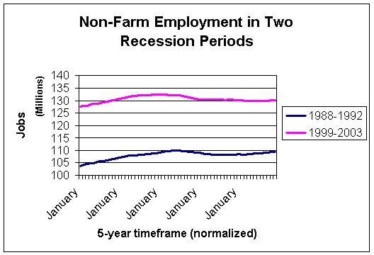
Notice the complete lack of a CEA-style upward spike anywhere in the same timeframe. (Remember, for both lines the period of recession falls right around the middle of the chart.)
Now, like I said, I’m no economist. But if you’re going to claim that the CEA was motivated by past economic performance, it sure seems more logical to me to look at how the economy did in a similar circumstance than it does to pick an arbitrary chunk of time and work from that. And in this similar circumstance, anyway, the prior performance seems to be much more in line with what we’re seeing today than it is with the projections we’ve seen out of the CEA.
What’s even more interesting is how similar the two periods look — for all our bellyaching about a “jobless recovery”, it would appear that what we’re seeing is nothing that different from what we saw the last time around. Perhaps this time it’s getting more attention because it’s white-collar folks who are the ones who are jobless; I was living in Ohio during the last recession, and I remember plenty of folks who worked for GM for whom that must have felt like a jobless recovery too.
Does this completely refute the anti-Krugman argument? Not entirely. It’s possible, for example, that there’s something about the 1990-91 recession that makes it a bad choice to be our control recession — we could reduce the chance of that by including data from several past recessions, but it’s getting late and I’m tired, so I’ll leave that as an exercise for the reader. It’s also possible that I’m misinterpreting the data, though given the speed at which my last post was answered I imagine if that’s the case I’ll find out fairly quickly. (If you want to, you can download my data set for this chart in CSV format and check it for yourself — it’s the subset of that Fed database I linked to above, with the data for the appropriate time periods already pulled out. Both the chart and the data set are distributed under the same liberal Creative Commons license as everything else on this site, so if they’re helpful to you, feel free to grab ’em and redistribute ’em, as long as you follow the minimal rules.)
And with that, I put my Junior Economist visor away for the evening 🙂

Comments
Joe
March 16, 2004
1:49 pm
The question remains, why are the numbers wrong?
It seems to me if you are going to cook the job numbers, you would want to low ball them. Then at the end of the year you can crow about how the economy is doing better than expected, instead of eating crow about being wrong and making whatever economic gains that did occur look weak.
Has the CEA been this wrong in the past? Did they overestimate in previous down times? Have they underestimated in good times? Do most economic recessions and recoveries effect the various industries and employment sectors in different ways, and does this make the future projections rather more guesswork than analysis?
I got a C in Econ, so I have no clue.