The WinFX Look
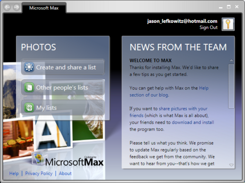
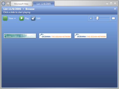
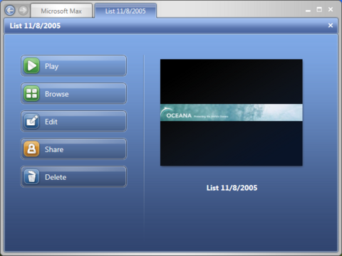
Been wondering what an app coded to use the new WinFX graphics engine (the one that will ship with Windows Vista) looks like, compared to a plain ol’ Windows app?
Here are some screenshots of Microsoft Max, which uses WinFX, to give you an idea (click the image to get the full-size version):
Notice how navigation between sections of the app is handled through tabs across the top — this UI approach is also visible in the preview screenshots of the new Office 12 UI we’ve seen.
UPDATE (Nov. 11, 2005):: More on this subject from Mike Gunderloy: Everything You Know About UI Design Is Wrong.


Comments
Sandy Smith
November 11, 2005
8:33 am
While tabs are better than a purely modal interface, I think this is a step backward in usability. There will definitely be a learning curve, and I suspect new users will be confused by the “oh, in *these* applications tabs are sequential, not simply equal choices” factor. This is pretty bold for Microsoft, as it will probably be yet another reason to slow adoption.
The how-to article displays that Windows developers mostly don’t get UI design. It’s not about looking pretty, it’s about usability. The language section addresses some of that, but the lack of simple rules for when transparency or 3D effects are to be used will continue the Windows tradition of having to learn a new GUI with every application you use. (Not that Apple is at all perfect, given their breaking of their own guidelines for “brushed metal”–but at least they have the guidelines that are simple enough to be quoted in every article on the subject.)
Jason Lefkowitz
November 14, 2005
5:13 pm
But it’s shiny!
Dug Falby
November 20, 2005
1:28 pm
It *is* shiny… So shiny it’s positively Mac OS X like;-)