Hunch’d
As far as I’m concerned, if you are the co-creator of something as insanely cool and useful as Flickr, you’d be completely within your rights to spend the rest of your life dining out on that accomplishment alone. (Hell, people have spent their lives dining out on a lot less.) So when I heard that Flickr co-founder Caterina Fake was launching a new product today, I was eager to give it a spin.
The new product is called Hunch, and Fake describes it as a “decision engine,” probably to avoid the mistake that Cuil made of pitting themselves directly against the Google monolith. (That kind of comparison sets up expectations that any startup would be hard pressed to meet.) A better term for it, though, might be “guided search” — the way it works is that you put in question you want an answer to, and then Hunch asks you some other questions to identify exactly what you’re looking for, and then it brings back a recommendation based on your answers. The more frequently you use the site, it promises, the better it will get to know you, and the more accurate its results will be.
It’s a clever idea, and the few test queries I ran through it were returned with decent answers. But my first impression of the service was actually incredibly negative — and it wasn’t until hours later that I realized why.
Here’s what you see when you visit Hunch for the first time:
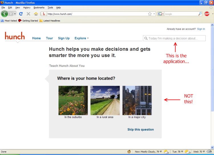
My annotations are in red; I put them there to illustrate how Hunch’s interface led me astray.
See, when you first visit Hunch, the first thing you notice is the ginormous front-and-center box asking you a simple question — in this case, “Where is your home located?” The whole schtick of the site is that it “learns” your preferences, so naturally you figure the way to start using it is to answer the question. So you do…
… which results in another simple question (like “do you prefer to work with numbers?” or “What type of French fries do you prefer?”) being asked. Answer that, and you get another. Answer that, and you get another. And on and on.
After you’ve answered five or six questions, you start to wonder where the hell the actual application is. You’re not there to answer questions, you’re there to get answers to questions. And yet Hunch just keeps asking and asking without giving anything back to justify why you’re spending all this time answering trivia questions about yourself — there’s no progress bar, no “you’ve answered 5 out of 15 questions!” notice; it’s just Questions Without End, like a blind date from hell. I eventually got frustrated and clicked away.
It wasn’t until much later that I realized what I had been missing — the trivia questions about yourself are entirely optional. You can get right into the meat of the application — the guided search process — by typing a question into the search box in the top right corner of the page. This search box is how you get into the “funnel” which has the answers you seek at the other end. But it’s waaaay too easy to miss, because:
- It’s in a place — the top right corner of the page — where sites typically put a site search feature, which is an element you usually only turn to when you have failed to figure out how to get where you’re going via the site’s navigation scheme; and
- It’s physically much smaller and less prominently featured than the trivia question is, making it easy to skip over if you’re just scanning the page
This is a shame, because it makes it far too easy for new visitors to get led off down the garden path of answering questions about themselves. That might help Hunch “tune” itself to their preferences better, but that only matters if they become long-term users; and they will only become long-term users if the site’s first impression is strong enough to bring them back a second time. Getting them into the guided search funnel makes that strong first impression; the trivia questions do not. So having them front and center is a huge mistake; it hides the very thing that makes Hunch immediately useful.
This could be remedied simply by moving the search box down from the top right into a more prominent position, like so:
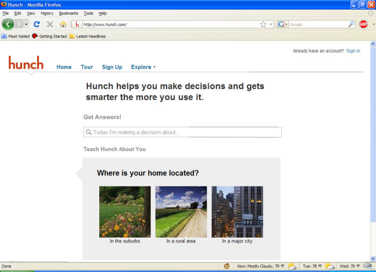
(Pardon the not-quite-perfectly-matched-up colors on some of the lines; this is a quick edit hacked together in Paint.NET in five minutes. But you get the idea.)
You wouldn’t have to have the search box in this position on all pages; once the user chooses one of the two funnels (the guided-search funnel, or the tell-us-about-yourself funnel), it could move back up to the top right. And for returning users (people who’ve already created an account, or who have the site’s cookie set), it could go up there on the home page too. But for new users, to make that critical first impression, you want to make it as easy as humanly possible for users to discover what it is you’re offering; and the personal questions don’t do that, the guided search does. So anything that gets them into the guided search funnel is a Good Thing, in my opinion.
And with that, I will stop offering unsolicited advice to the designer of one of the most famously usable Web applications ever designed, before the gods decide to punish me for my arrogance and I spend the rest of eternity condemned to pushing a boulder uphill, or reading TechCrunch, or some other horrible fate.
UPDATE (June 16): Caterina graciously takes the time to respond, and to share some of the thinking that went into Hunch’s UI, in the comments.

Comments
Caterina Fake
June 16, 2009
5:42 pm
Hey Jason!
So, I’ve given this topic a great deal of thought. 🙂 And the reason that we didn’t steer people into the “guided search funnel” at the outset was answered obliquely by you in your third sentence:
“The new product is called Hunch, and Fake describes it as a “decision engine,†probably to avoid the mistake that Cuil made of pitting themselves directly against the Google monolith. (That kind of comparison sets up expectations that any startup would be hard to meet.)”
You’ve homed in on what we were trying to avoid with Hunch’s initial release: the expectation that Hunch=search engine. We don’t want ppl to think that they’ll enter text and get to an SRP — this expectation is so ingrained that people would end up being disappointed in Hunch.
Better, we thought, to ease people into the idea of Hunch, teach them what it is. Show that it 1. learns about you and then 2. gives you answers to topics. #1 is at the heart of what distinguishes Hunch from other sites, and while it is indeed optional, your results are significantly improved by teaching Hunch about you AND the questions familiarize the user with Hunch’s question-asking interface.
We also anticipate that the largest body of users will arrive at Hunch not from the Hunch home page, but from a results on a search engine, and will land on the first page of a topic, or even on a result page. But this will bear itself out (or not) in coming months.
The “Spotlight” style search that Hunch does, limited as it is to Hunch’s own set of topics, is also a behavior that is gradually being learned by web users. (OS users of certain OS’s have already gotten used to it). “Upper right hand corner of web site search box” more closely reads as “search *this* site, not the web as a whole”. That’s why it is where it is.
We have a “center search box” design standing by waiting for Hunch users to familiarize themselves with the product, and for the “contributor” phase of the product to be supplanted by the “user” phase. But until that day, upper right hand corner it is!
Thanks for your post, and for taking the time to think through how to improve our UI! And giving me the chance to talk a little about our design philosophy.
Cheers! And please, come on back to Hunch!
Jason Lefkowitz
June 16, 2009
8:38 pm
Thanks for taking the time to share this thinking, Caterina! It’s fascinating to see the decisions that go into things like this…