True Tales of High Adventure! With Boobs
Everybody’s favorite paleocon, the War Nerd (of whom I have written in appreciation before), posted his latest opus a couple days ago on the subject of the Battle of Gettysburg — or, more specifically, paintings of the Battle of Gettysburg:
The fight at Gettysburg was the cleanest, finest fight ever in the world. That’s why I grew up just staring for like hours in hot afternoons in my room at those paintings. You know the Gettysburg paintings I mean? If you do, you probably know them the way I did before I started looking up stuff for this article: you know the paintings by heart but don’t much know or care who made them. As a kid I bet I could’ve drawn a decent replica of my favorite, the one with rebs and Yankees fighting hand-to-hand along a rail fence. I remember how the guy who painted it imagined the moment when the first line absorbs and infantry charge, the perfect way the main body of the attack is already sweeping past with the stars and bars high, but some of the Fed defenders have survived and a fraction of the Rebel attackers has to stop to deal with them, mop up. Every single hand-to-hand combat is so perfect.
He ends his post with a lament that despite hours of Googling, he can’t find that painting he remembers anywhere on the Web.
As I read that, I thought Aha! The War Nerd may not know where to look for his painting, but I do! That’s because there’s one painter in particular whose name is practically synonymous with paintings of Civil War battles — Mort Künstler.
Künstler, whose Web site modestly describes him as “the premier historical artist in America,” is a favorite artist among those who like history more than they like art. He’s made a bit of a mini-industry out of painting Civil War scenes — which his site, in another fit of uncontrollable modesty, describes as “masterworks” — usually with a bit of romantic Lost Cause Confederate nostalgia for frosting.
Which wouldn’t be a problem if his paintings were any good. But for the most part, they are not.
Künstler’s problem is that he appears not to know how to paint human beings. Oh, he gets the broad strokes right — his subjects generally have the right number of limbs and orifices (at least as far as we can tell, given that they’re wearing uniforms). But there’s always some detail that makes you scratch your head and think “wait a minute, human beings don’t look like that.”
Consider, for instance, his painting “Eve of Battle,” in which he manages to capture one of my personal heroes, Union general John Buford, striking a pose that’s startling in its unlikeliness:
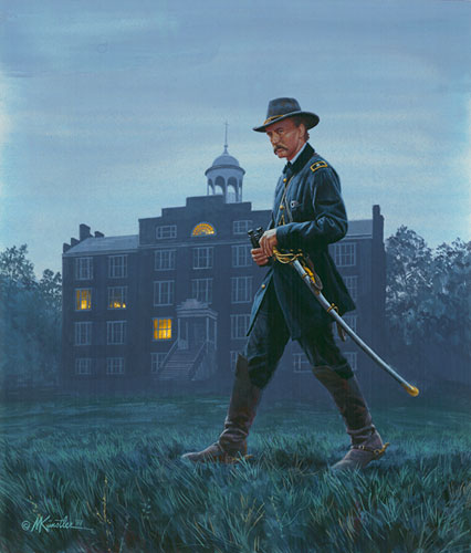
The problem with this painting is that I’m not sure if the subject is supposed to be walking or standing still. Buford’s legs are splayed wide, as if caught in the midst of a purposeful stride, and the heel of his left foot is raised off the ground; but his upper body appears relaxed, at rest. It’s weirdly dissonant. Human beings don’t move like that.
For a more dramatic illustration, I give you Künstler’s “The Lincoln-Douglas Debates,” in which he manages to turn both Abraham Lincoln and Stephen Douglas into bizarre animatronic simulacra:
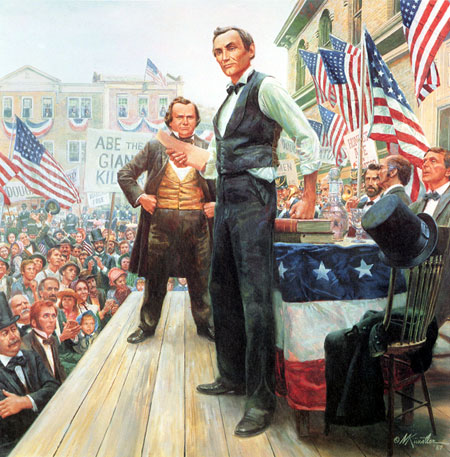
The perspective on this one is so weird I fear it can induce dizziness. You may want to pop some Dramamine before staring at it for too long, just in case.
Want another example? Too bad, you’re getting one. This treacle tart is titled “Especially for You“:
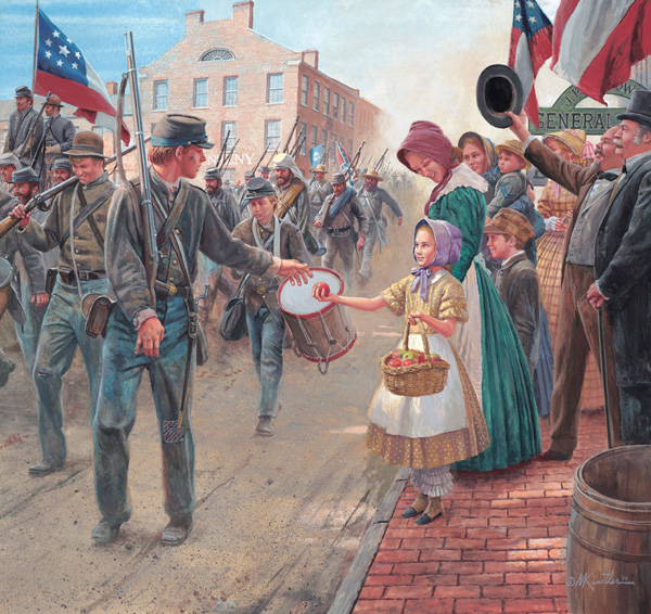
All I have to say about this one is that the faces on the little girl and her mother terrify me. They look like mannequins possessed by Evil Spirits, condemned to wander the Earth for all eternity as punishment for sins too terrible to name. Which I’m pretty sure is not the response Künstler was shooting for.
Anyway, the War Nerd’s column got me digging through Künstler’s site in hopes of finding the particular painting he was jonesing for. I didn’t find it, alas. But I did find something that shocked me to the core: evidence that, at one point, Mort Künstler was actually (gasp!) a decent artist.
See, when I went past Künstler’s official site and started digging around his Wikipedia entry, I discovered that, before he became the Thomas Kinkade of the re-enactor set, Künstler paid the rent by working as an illustrator-for-hire for a range of magazines — including the “men’s adventure” pulp magazines of the 1950s and early ’60s.
“Men’s adventure” books were a less-slick, more-macho Greatest Generation version of Maxim or FHM; designed to appeal to men’s less… ahem… refined instincts, they typically featured a mix of action (hard-boiled war or adventure stories), soft porn (cheesecake pin-ups and stories of Ravished Women In Distress that were racy by 1950s standards), and ads for “self-improvement” products like Charles Atlas bodybuilding courses. Titles like For Men Only and Stag made it clear what you’d find inside.
The twin shocks of the social revolutions of the 1960s (which made the “men’s adventure” vision of hard-bitten, gun-toting masculinity seem impossibly quaint) and the Vietnam War (which killed the market for stories of upright, selfless G.I.s mowing down hordes of Evil Foreigners) put the “men’s adventure” genre into its grave. And, as James Lileks reminds us, it also didn’t help that the magazines themselves kind of sucked:
As soon as I’ve scanned everything I plan to burn it all. It’s that’s creepy. It’s that sad. It’s that pathetic. These aren’t nudie mags in the usual sense – probably because there’s usually no nudity. Just capering cuties in grainy black-and-white making the clichéd “you’ve caught me in my nightie!” face. The stories are bombastic but empty, always exposing something or other – sin, vice, sinful vice. Typical tales: “The Harlots of Des Moines!” or “Girls For Sale in Sex-Drenched Dusseldorf!” And there’s always a Nazi story. In every issue, Nazis. Why? Because a large part of the target demographic had spent its youth whipping Nazi butt, I suppose. And another part of the demographic really got off on Nazis, one fears.
But in spite of all that, for a couple of decades it was a thriving corner of the pulp publishing universe. And it paid Mort Künstler’s rent.
I don’t bring this up to giggle at the idea of “the premier historical artist in America” illustrating stories with titles like “The Harlots of Des Moines.” I bring it up because some of Künstler’s work from that period is — dare I say it? — pretty good.
A gallery of some covers of men’s adventure covers painted by Künstler makes the point pretty effectively. They’re not high art, but many of them are alive in ways that his later, more reverent historical work simply is not. Let’s take a look at a few of them, which I reproduce here with the gracious permission of the American Art Archives.
Consider this cover, which in a just world would be what you’d find when you look up “MALE” in the dictionary:
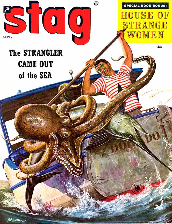
Look at that! You may think you’re tough, Jack, but when was the last time you got into a fistfight with an octopus the size of a full grown man? But that’s just what our hero is doing — and all while looking cool with awesome ’60s shades and a couple days’ worth of stubble. And the texture of the octopus’ skin is perfect — slimy and scaly looking.
It’s about as perfect an illustration as you could imagine for the story title given: “The Strangler Came Out of the Sea!” Goddamn right it did — and then I fucking speared it in the eye! Now that’s how you spend a weekend.
But, as noted above, the men’s adventure pulps weren’t all octopus wrestling; they had to work in plenty of cheesecake as well. Here too, Künstler delivered:
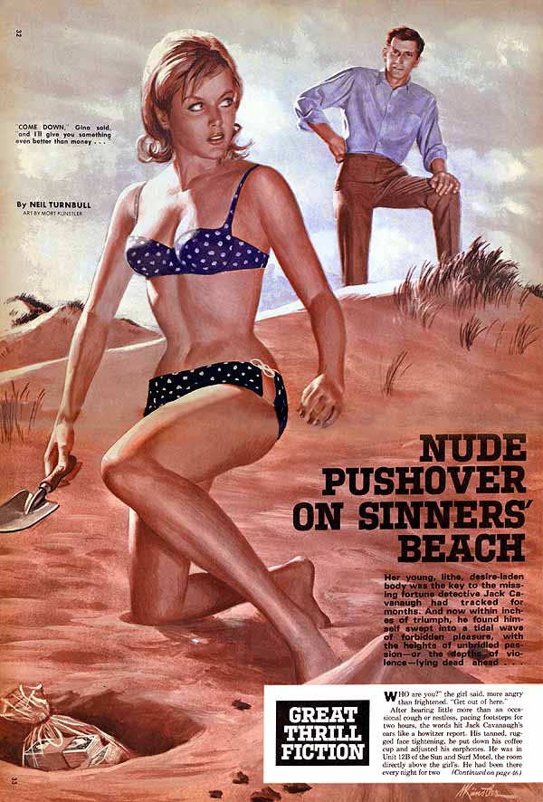
Let’s concede right up front that the gentleman staring down at Miss Moneypenny here isn’t rendered particularly well. In fact, he looks practically unfinished; as if Künstler hastily sketched him in ten minutes to deadline.
But that’s because nobody reading this magazine gave a damn about the guy. They’re reading it for the babe. And the babe is rendered perfectly, from her figure (lush and curvy, but not comically exaggerated) right down to the little details like the look in her eyes — here she had set aside her whole afternoon to dig up buried treasure on Sinners’ Beach (!) in a skimpy bikini, and now this guy has the cojones to interrupt her with his lame-ass pickup lines? You can see from her knitted eyebrows and pursed lips what she’s thinking — “I wonder how many times I’d have to hit this chump with my trowel to put him and his Sansabelt slacks out of their misery?”
This is not your standard Damsel in Distress. This woman is a stone cold killer. Get between her and her dough and you’re gonna get murdered with some kind of gardening implement.
So young Künstler could handle action scenes, and he could handle cheesecake scenes. But what if you wanted some action mixed in with your cheesecake? They are, after all, two great tastes that taste great together. Well, never fear, he had your back there too:
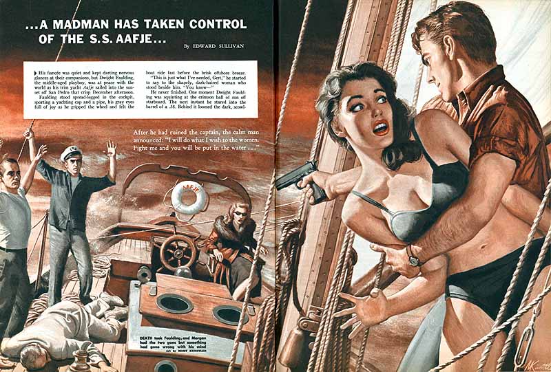
Pirates! Armed madmen seize control of your boat — and the only weapons you have to fight back with are your trusty .45, your manly jawline, and your (bikini-clad, natch) secretary. What do you do? What do you do?
(Well, you shoot them, of course. They are madmen, after all; that’s a job description that has “don’t bother negotiating with me” written all over it. But be sure to tote the secretary around while you’re doing the shooting, that’ll really help your aim.)
And if you want to leave the realm of plausibility behind completely? Say, with a story about wild gangs of outlaw surfers out for kicks?
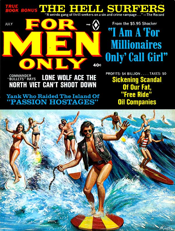
Child’s play! You can almost hear Künstler’s derisive snort when he was handed the assignment. “‘The Hell Surfers?’ Hey, wake me when you’ve got a real challenge.”
Browse through the rest of the gallery and you’ll see what I mean. These illustrations aren’t the Mona Lisa, but they have a style to them that Künstler’s historical work completely lacks. They feel so much more human, so much less weighted down. It’s as if the artist was liberated by the fact that his subjects were so thoroughly tawdry — as if, without the burden of depicting Great Personages, he could just let his imagination run wild.
And occasionally, he could even come up with one that was downright poignant:
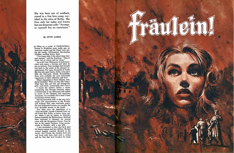
Yes, it’s an illustration for an icky domination fantasy about a German woman who’s reduced to whoring herself out to G.I.s for chocolate bars and Lucky Strikes after Allied bombers burn her city to the ground. But put that aside for a second and look at the composition: the way the red flames of the burning city turn into the tendrils of her hair and the blush of her cheeks, the way her eyes look toward the sky — towards the place from which death rains down, true, but also towards redemption, towards Heaven. It’s a much better piece of work than it has any right to be.
So why did I bother writing all this up? Because I was struck by the sad irony of it all. Künstler’s pulp work is so interesting, but it hardly made him rich, and it definitely didn’t make him famous. Today, though, he is both — but the work that made him so is strikingly less accomplished, less compelling, than the stuff he was churning out for pennies for the front covers of trashy magazines decades earlier.
Was this the result of a conscious compromise — a decision made somewhere along the line to focus less on the art and more on the marketing? Or was it something that he slid into gradually, over many years? Is he happier now that churning out crap has made him “the premier historical artist in America” than he was when he was sketching out octopus fights in a garret for beer money? Or does he secretly miss those days when he was free to churn out wild flights of fancy in bold colors without anyone in the world knowing his name?
There’s a great story hidden away in there, somewhere.