Ubuntu 11.04: Everything Old Is New Again
So the latest version of my OS of choice, Ubuntu, came out yesterday. Most of the updates Ubuntu 11.04 (development codename “Natty Narwhal”) introduces are pretty pedestrian (Firefox gets bumped to 4.0, for instance), but there’s one really major change: an entirely new desktop environment, called Unity.
Unity is intended to merge the desktop interfaces of desktops, netbooks, and touch-based devices like tablets into a single experience that works great on all types of machine. To this end, it introduces several big changes to the GNOME user interface, two of which I’d like to focus on in particular.
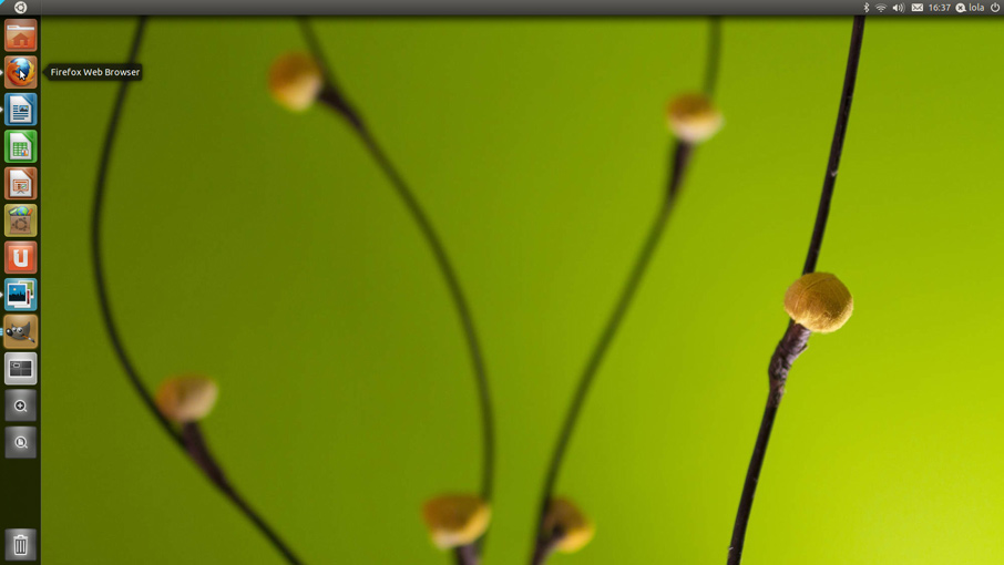
The first of these is the “Launcher.” The Launcher is a vertical ribbon that runs down the left side of the screen and contains icons for all your most frequently used applications, tasks and locations. It replaces the familiar menu options in the top panel that are typically used to start applications in GNOME.

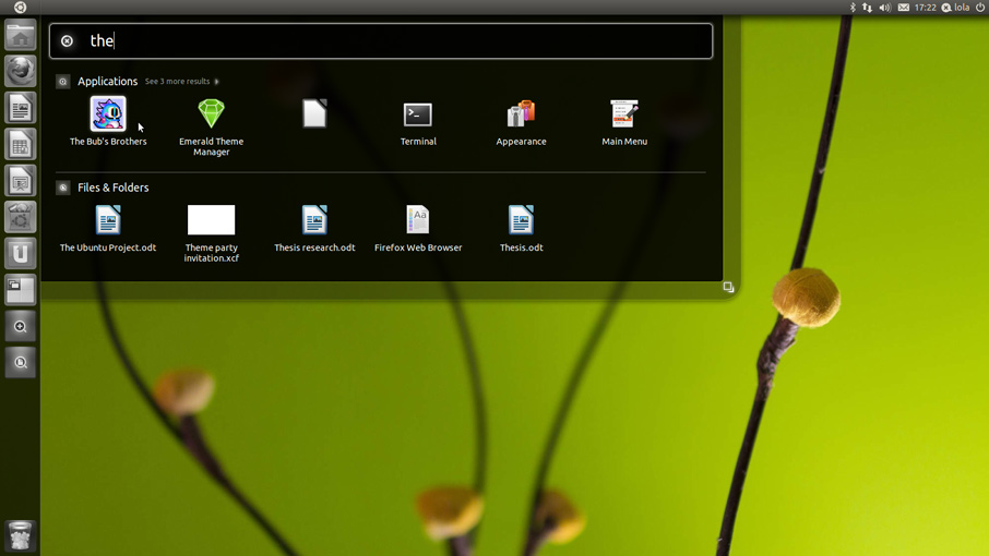
The second is the “Dash.” The Dash provides an alternate, less mouse-oriented way to launch applications and open documents — rather than mousing through a series of menus, you just invoke the Dash and start typing the name of what you’re looking for. The Dash shows you a list of everything on your system that matches what you’ve typed, and the list narrows down with each new letter you type. It usually only takes three or four letters to find what you’re looking for.

There’s been a lot of grumbling in the Ubuntu community about these changes (as happens any time anyone ever changes anything in a much-used software package), but I think that conceptually they’re both good ideas; they simplify the UI and make it easier to find the things that you use most frequently, which is a good thing. In a traditional menu bar, every menu item has the same prominence, so it’s easy for the few things you really need to get buried in lots of stuff you don’t. The Launcher and the Dash help cut through the cruft.
So my beef with them isn’t that they’re bad ideas. My beef with them is that they’re bad implementations.
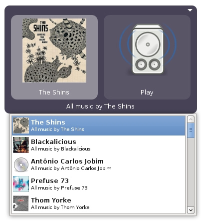
See, I’ve been spoiled. For years now I’ve used two add-ons that are so useful they’ve become must-have parts of my Ubuntu toolbox. The first, GNOME Do, provides the same type-to-find interface as the Dash does:

Image by David Siegel.
But beyond that, what’s cool about GNOME Do is that it has a plugin architecture, so other developers can add hooks into it that connect it to all the applications you use every day — and lots have! Which means that beyond just finding files and installed applications, GNOME Do can find anything. Start typing a person’s name and GNOME Do will pop up every context in which you know them. Are they in your email address book? GNOME Do can launch your email client and start a new message to them. Are they in your Skype contacts? GNOME Do can have Skype call them. Did their crappy garage band cut a CD that they insisted on giving you a copy of? GNOME Do can start playing it. And all of these actions are equally easy to invoke — just press the down-arrow to scroll through the list of available actions and hit Enter to kick that action off. It’s really absurdly powerful stuff.
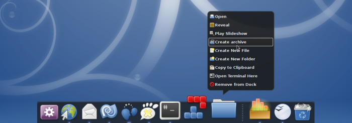
The second indispensable tool is Docky. Docky started life as a plugin for GNOME Do, but it eventually split off into its own application. As you might have guessed from the name on the tin, Docky provides… a dock:

Which is sort of the same thing that Unity’s Launcher does. But what’s great about Docky is how configurable it is. You can set it to be variable-width and centered, like the OS X dock, or fixed-width, like Windows 7’s taskbar. (I prefer the Windows 7 style myself, for the reason that Bruce Tognazzini identified ten years ago: when a dock or taskbar’s width is variable, as in OS X, the position on the screen of each icon in the dock will be different at different times depending on how many icons are in the dock at that moment. A fixed-width dock with the pinned icons on one side means those icons will always be in the same place.) Docky looks gorgeous, unlike the Launcher, which looks kinda meh. And like GNOME Do, Docky has a plugin architecture, so devs can build “docklets” and “helpers” to connect up Docky with your favorite apps.
All of which is why I disabled Unity when I updated my Ubuntu box to 11.04 — I already have a setup that does what Unity wants to do, only better. (Thankfully, while Unity is enabled by default in 11.04, you can easily disable it and continue to use other tools like GNOME Do and Docky if you wish.)
It’s good, I suppose, to see Canonical bringing these UI concepts to the general population of Ubuntu users; anything that has to be installed separately from the OS is never going to have the audience it would have if it came preinstalled, so this is going to introduce ideas that GNOME Do and Docky have been working on for ages to a whole new crowd. It saddens me a bit, though: first because Unity’s implementation of these ideas is currently not nearly as compelling as GNOME Do and Docky’s (though I’m sure it’ll get better in future Ubuntu releases), and second because Unity, by the simple fact of being preinstalled on the most popular desktop Linux distribution, may end up crowding out GNOME Do and Docky altogether, in much the same way that IE ended up crowding out Netscape. I would have been happier if Canonical had adopted and extended the GNOME Do and Docky projects, rather than competing with them.
UPDATE (1:49PM): GNOME Do and Docky developer David Siegel responds in the comments, with some context on how Unity and Do/Docky came to diverge. As far as I’m concerned, anyone who 1) built something as freaking cool as Do and Docky and 2) reads this blog is officially a rock star.
UPDATE (4:00PM): A commenter on Reddit says that Dash has a plugin architecture, too, called “lenses.” Which it turns out is true! I’ve tweaked the text of the post to remove the implication that Dash can’t be extended. But there’s still one big difference between the extensibility of Dash and that of Do: there’s already a library of plugins written for Do that hook it up to all sorts of commonly used GNOME applications, where Dash is starting from scratch.

Comments
Oscar
April 29, 2011
1:39 pm
Besides the user interface, are there any other changes (good or bad) in the new GNOME? I’ve been pretty happy with ArchLinux and KDE ever since an ubuntu upgraded killed my ability to connect to my network, but I’ve been thinking of giving GNOME another shot. It seems like more apps, particularly Firefox and Chrome, integrate better with it.
Jason Lefkowitz
April 29, 2011
1:43 pm
It’s hard for me to say because Ubuntu has slowly been diverging from standard GNOME; these latest changes are just the most recent move in that direction. For instance, GNOME 3 has its own new user-experience module (GNOME Shell), but Canonical replaced it with Unity instead.
I’m not sure at what point Ubuntu-flavored GNOME becomes a full out fork of GNOME itself, but they are certainly moving in different directions.
David Siegel
April 29, 2011
1:46 pm
Hey, glad to hear you like Do and Docky. I actually created GNOME Do, and worked on Docky as a part of Do. Canonical hired me in 2009, and I was the lead designer on Unity. I tried very hard to bring some of the ideas from Do and Docky to Unity, but there were “too many cooks spoiling the broth,” so those ideas didn’t get fully realized. I only want to cook the tastiest broths, so I left Canonical right before Maverick was released 🙂
Mike
April 30, 2011
12:58 am
I love Do almost as much as you. However, I wouldn’t discount and bash Unity as much as you seem to be doing in this post. You claim that Do is better because it has plugins, and while thats true, I have to think that with the power of Ubuntu community all excited about Unity, Do won’t be the leader for much longer. Especially since Do’s extensions have been pretty much at a stand still for the past year.
kit kat
May 5, 2011
12:50 pm
I mainly have ubuntu because windows vista wouldn’t stop crashing, and I just upgraded to the new verison. I thought I’d give you a perspective from someone who isn’t very technically inclined, I REALLY don’t like unity. It’s a lovely concept, however, when I go into applications there are three categories, most frequently used, installed, and available for download. But there’s no organization inside of that, all my applications are jumbled together. If I want to play a game but haven’t picked one yet and would like to stare at the list for a while, I can’t because there’s no category for it. The way I like to get to know new systems is by browsing around for a while, but there’s no organization now. For those of us who don’t always know the name of what we want unity is a nightmare. I suppose I should just be grateful that they left system settings in one organized bunch instead of scattering that to the four winds too. If I don’t stumble upon some secret option that makes everything organized again I’m going to switch back soon. Ubuntu already left me confused from time to time, now it’s just annoying.
Avinash
May 6, 2011
8:20 am
Hey kit kat.
The applications are actualy organized properly. Its just not directly visible on the outset.
Instead of opening the launcher by clicking the icon, look at the unity dock, you will find one which looks like a magnifying glass.
Right click that and you will find the application categories.
thelaststud
May 22, 2011
2:20 am
@kit kat
nooooooooooooo dont go back to vista…you know you can switch back to gnome classic right? and as the author says you can also use GNOME Do to search for stuff
Jordan Older
April 24, 2014
6:25 pm
Docky is the best and should be default in all Linux distros!