The image that illustrates the White House’s communication failure on health reform
 The big news today is obviously the Supreme Court’s 5-4 decision to uphold the Affordable Care Act, which removes the final major challenge that could prevent the health care reform law from moving to implementation.
That’s a victory — one that will be welcomed by millions of previously uninsured and underinsured Americans. But getting to that victory required traveling a long, hard road. And I believe that the journey was longer and harder than it had to be, because the Obama administration seemed reluctant to really made the case to the American people that this health reform package needed to pass — and when they did, they did so in ways that were ineffective, or even self-defeating.
Longtime Readers will know that this is a critique I have been making of the administration for years now. (See here for the most fully fleshed-out version.) But I saw something today that really crystallized why I felt this way. It brought back in one sudden rush all the frustration I felt watching progressive leaders cede the field to Tea Party wingnuts back in 2009 and 2010. So as a professional communicator myself, I wanted to highlight it for you — as an example of how not to do advocacy communications.
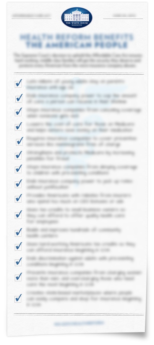
The “something” in question is the image over there on the right. (Click it for a full size version.) It’s an image that the White House proudly blasted out across all its social media channels (such as this tweet, for instance) this afternoon, after the Supreme Court decision came down. It’s also featured on the White House blog. And it sort of illustrates everything that has been wrong about how the White House has talked about this issue from day one.
Let’s start at the top: the overall concept itself. The White House calls this an “infographic.” But it isn’t. An infographic is a visual representation of information — an illustration that takes raw numbers or disconnected facts and makes them comprehensible by using graphics to pull out trends and tendencies. This does nothing of the sort; it’s just words with checkboxes next to them, saved in an image file format. Just saving text as a JPEG does not magically make it an infographic, as Edward Tufte would probably explain to anyone he saw touting this as an “infographic” just before he beat them to death with one of his books.
Next, the presentation. An infographic is a type of visual communication, and one of the basic concepts of visual communication is that the person on the other end should still get a sense of your message even if they don’t read any of the words. There’s lots of ways a good graphic designer can do this; colors, type, and imagery can be applied to summon up feelings in the viewer that match the tone of your message, for example. Look at the famous “Uncle Sam Wants You” recruiting poster from World War I, for instance; even if you don’t read the words, Uncle Sam’s stern expression tells you that Serious Matters are afoot, and his pointing finger tells you that they need your attention. The words are powerful, but you can get the vibe just from the art.
This image does none of those things. Look at it for a second, taking care to look at the overall design rather than reading the words. (To make that easier to do, here’s a version of the image with the text fuzzed out.)
What does it look like when you’re looking at the design and not the words? It looks like a memorandum, or maybe a doctor’s prescription. (My guess is that they were shooting for the latter, to give it a “health care” feel.) Neither of those are things that anyone would associate with a feeling of victory, or freedom from fear, or social justice, though. They’re boring, bureaucratic, process-oriented documents. And even worse, they’re documents you usually get when there’s bad news on the way, or some annoying problem you have to deal with. You don’t get a prescription when your kid graduates from college; you get one when you get a rash that won’t go away. You don’t see many people posting their prescription slips on Pinterest.
Additionally, because so much of the design is taken up by words, when you scan the overall layout it comes across as a “wall of text” — a long, monotonous document. That’s death online, because online readers don’t read; instead, they quickly scan through whatever they’re looking at, searching for nuggets of information that are particularly interesting. But since the text here lacks any visual cues to support that behavior (no boldfacing of important words, no variation of font size, etc.), it’s going to be quickly discarded as uninteresting by a lot of people. On top of that, the typeface used to present the words is harder to read than it should be, especially when the image is viewed at less than 100% size; I’m guessing they were aiming for a “handwritten” feel, which is cute in theory, but in practice it just impairs the legibility of the message.
Now that we’ve looked at the design, let’s look at the copy — the words. Because this image is so text-heavy, the wording it uses is absolutely critical to any effectiveness it may have. Unfortunately, it falls down hard on this count too.
First, the authors seem unable to decide how they want to organize the information they’re trying to present; sometimes it’s organized by who wins (“millions of young adults,” “small business owners,” “hard-working Americans”), sometimes by who loses (“stops insurance companies,” “ends insurance company power,” “insurers who spend too much on CEO salaries” — hey, I’m seeing a theme here), and sometimes by outputs (“hundreds of community health centers,” “state-based marketplaces”). It gives the copy a weirdly dissonant feeling; it doesn’t hang together cohesively, the way a good message should.
Second, the frequent repetition of “beginning in 2014” after several of the items makes it read like it a document with lots of asterisks indicating the presence of fine print, and people know that the fine print is where documents hide the parts that are really going to screw you over. It’s true that many of the act’s provisions don’t kick in until 2014, but in a mass-audience message like this, it’s not necessary to spell that out; just give people a link to a FAQ listing when each provision kicks in, or just lead off with a single sentence like “By 2014, the Affordable Care Act will:”. That way you only hit the bad news (that so much of the good stuff the act is supposed to provide is still years away from being available) once, rather than multiple times. The key to implanting a message in someone’s memory is repetition, and by repeating “beginning in 2014” over and over the message this image plants is that if you need help today, this legislation is not going to be much help.
The third criticism I have of the text is the biggest — and, to my mind, the most illustrative of the administration’s problems in communicating about this act overall.
It can be summed up in a simple question: what’s the narrative thread connecting all of these list items together?
Here’s what I mean. A good message is all pulled together around a single idea; that way, even if the reader forgets the individual details, the underlying message can still stick. But this message reads like a grab-bag of different programs for different people; there’s no through-line connecting the tax credits for small business owners, say, to the ability of young people to stay on their parents’ insurance. (Except for the sense that these are all good things, of course, but that’s an awfully weak reed to prop yourself up against.) The two details stand in isolation, rather than reinforcing a common theme.
In the defense of the White House communications staff, there’s probably not a lot they could have done on this last point. The message reads like a grab bag because the Affordable Care Act is a grab bag. The way to fix that would have been to frame it better when it was first being drafted, but that ship has sailed. Still, I can’t help but feel that if one of the things that makes your legislation hard to sell people on is the sense that it’s too complicated and hard to understand, the way to overcome that is not to reel off a list of unconnected facts; it’s to tell people a story that places those facts into a narrative context.
This has been the most glaring omission from the administration’s communications efforts around health reform ever since they first took up the issue. There’s no narrative, no story, and that’s fatal, because stories are what move people. “Death panels” wasn’t true, but it was a hell of a story, and it stuck in peoples’ minds long after lists of individual reforms had faded away. That’s why people say they like individual planks of the Affordable Care Act, but dislike the act itself; they don’t remember that the two are connected. Ask them about “health reform” or “Obamacare” and the first thing that leaps to their mind is the narratives opponents were putting forward against it, not the individual reforms that supporters were (and still are!) talking up.
Narratives, in other words, stick. And the fact that we’re now at the tail end of three years of furious debate and supporters of reform still haven’t come up with a narrative of their own — a narrative that something like this infographic could be framed around — explaining why it’s worth supporting is pretty damning.

Comments
jwb
June 29, 2012
12:38 pm
The image takes the form of a to-do list. The point is that ACA accomplishes a lot. This is the message that is conveyed by the image and that you get whether or not you have read the text. I’m very surprised you missed the most obvious aspect of the graphic.
Your point about the mish-mash in the text itself is excellent, but I don’t think the designers expected the target audience to read past the second or third point on the list. The text is really a graphic element, not a content element: the points on the list exist only to make the list appear long and to provide relevant content for anyone who happens to look at other points. It has not been constructed, I think, to produce a comprehensive view of the legislation, but only to contribute to the “story” that ACA is important legislation that addresses multiple problems. Now, you can certainly question whether the disconnect that the graphic assumes between story and details is something that supporters of the legislation should be banking on, but the issue is not really that the graphic lacks a compelling story.
Jason Lefkowitz
June 29, 2012
12:43 pm
Because to-do lists always come on official-looking letterhead with a watermarked caduceus.
jwb
June 29, 2012
12:54 pm
No, you are interpreting the image as text rather than as a graphic. Think about the person who just sees this in small form on say Facebook. They see wall of text, as you note, with check marks. The checkmark signifies: accomplished. And it’s a long list of “accomplished.” The FB viewers don’t read the text, so who the hell cares what it says. The FB viewers only see “accomplished.” And they see “White House.” So the story conveyed is: “White House accomplished lots of stuff in getting ACA passed.” Again, you can take issue with the indifference of the graphic to the details of ACA, but insofar as you read the text for content you are misconstruing the target of the design.
bgs
June 29, 2012
6:09 pm
When I started reading your article I had to stop and tried enabling javascript and disabling the adblocker because I couldn’t see any infographic image on the right that you were talking about. Then I realized that the wall of text I had been automatically ignoring was the “infographic” image and it had been visible all along. I tried to read through all the infographic, and only had to pause to rest my eyes a few times before forcing myself to get to the end. Then I read the rest of your article.
That really made your point.