Against line-chart liberalism

All the buzz in the mediasphere this week has been about the just-announced departure of Washington Post wunderkind Ezra Klein from that storied institution in order to turn his “Wonkblog” into a full-fledged independent news operation of its own. Yesterday’s announcement that Slate economics columnist Matt Yglesias is joining the new venture has only stoked the buzz further. (Klein and Yglesias are friends whose association goes back to the early days of the liberal blogosphere, so in a sense this is a little bit like hearing that someone’s getting the old band back together.)
I hold no brief personally against either Klein or Yglesias, and I wish them personally all the best of luck with the new venture. But I do hold a brief personally against what has emerged as both men’s signature style — not so much in how they have used it, actually, as in how I’ve seen it seep into the work of communicators with progressive campaigns and advocacy groups.
For lack of a better term, I think of this style as “line-chart liberalism.” I call it that because I have literally been in meetings where people have said that, if only they could find the right chart — if only they could find the right set of data to present — the message they believe those data communicate would inevitably penetrate the mass consciousness.
This never works, but I’ve never seen anyone try to address why. So I thought I’d take a moment to explain why I oppose it, in the (vain, I know, but bear with me) hope that maybe it will convince some of those folks to alter course in the future.
The most fundamental element of this approach to communications is that it is data-driven. It makes its point with data, rather than with appeals to emotion. That, in and of itself, is not a bad thing; opinion-mongers who can make use of valid, provable data and basic methods of statistical analysis are to be commended, not shamed. They are a necessary corrective to the standard form of establishment opinion, which is to wave one’s hands in the air while making sweeping pronouncements based entirely on what a cab driver told you or what you overheard your daughter’s friends talking about when you were driving them home from the Justin Bieber concert. Arguments that are grounded in data are a cut above arguments that are grounded in nothing at all.
The standard knock on this approach is that it turns its practitioners into “technocrats” — bloodless pedants whose view of the struggles of humanity is obscured by an accountant’s green eyeshade. My critique of the form is slightly different. It’s not that it misses the argument for the data; it’s that it thinks the data, all on its own, is the argument. Present The Data, this approach says, and you have fulfilled your mission of educating the people. The Data speak for themselves; the role of an intermediary is merely to determine which of The Data are significant, which deserve to have a spotlight thrown upon them.
One reason why I disagree with this is because of a core assumption that is embedded deep within it, namely that public policy is at root a values-neutral project. In this worldview, there is an objective Good that we all strive towards, and our progress as a society can be measured by the velocity towards which we approach that objective Good. We can determine this velocity by taking measurements — by gathering Data. These data will then tell us if we are on or off course, in much the same way that star sightings can do for a mariner lost at sea.
This works for the mariner, because the stars are objective. It is not a matter of opinion where in the sky the North Star is. But “good,” in terms of public policy, is most definitely not objective. My definition of what is Good is informed by my background, my experiences, my ideology; my values. And your definition of what is Good is informed by yours. Your North Star, in other words, is in a different place than mine is — which makes trying to navigate by taking sightings of it a perilous proposition.
Say, for example, we’re looking at data about income inequality. For purposes of discussion, assume that these data are rigorously accurate — they have been gathered and presented without bias. Now assume that they show income inequality is rising fast. As a progressive, I would look at those data and say they indicate something bad is happening, that they reflect a draining of wealth from those who need it most to those who need it least. A conservative, on the other hand, might look at the same data and say that they indicate something good — that those who have worked the most energetically and productively are reaping a greater share of the rewards of the economy than those who have not.
These conclusions are diametrically opposed to each other, but they both rest on the same foundation of unimpeachably accurate data. The difference is the core assumptions about how the world works that I and my hypothetical conservative debating partner bring to how we see them. So the data, by itself, makes no argument; an argument only forms when those data are combined with a worldview, a Weltanschauung.
The bigger problem, though, is that assuming that data can tell its own story ignores something fundamental that we know about how communications between humans works. People aren’t motivated by facts; they are motivated by narratives, by stories. Telling each other stories are how we affect each others’ worldviews, for everything from the most critical subjects to the most trivial.
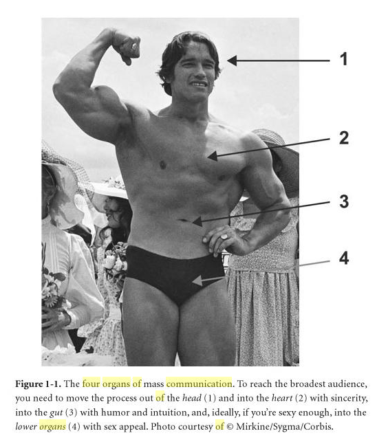
Image from “Don’t Be Such A Scientist” by Randy Olson. Published by Island Press, 2009.
My friend Randy Olson, who has been working for years helping scientists learn how to get the general public interested in and excited by their findings, has written about this extensively. One way he helps scientists (who are not generally known for their storytelling skills) understand the concept is through what he calls the Four Organs Theory of Communications:
When it comes to connecting with the entire audience, you have four bodily organs that are important: your head, your heart, your gut, and your sex organs. The object is to move the process down out of your head, into your heart with sincerity, into your gut with humor, and, ideally, if you’re sexy enough, into your lower organs with sex appeal.
The problem with line-chart liberalism is that it stops at the head, never even attempting to get any further down. And that is fatal for a communicator, because the head is the least effective organ at driving people to take action. The head is analytical; it wants to study messages, to pick them apart the way a freshman biology student dissects a frog. Messages that get past the head and into the lower organs get closer to the impulses that drive people to move, rather than to just think about the pros and cons of moving. Appeals that stop at the head never get that opportunity.
This is what frustrates me about line-chart liberalism. That sentiment makes the deadly assumption that a chart, all by itself, can tell a story. It can, but only to people who know how to read it — people who have been educated to read and understand visual interpretations of data. If you are not one of those people — if you’re one of the vast majority, in other words — putting your story in the form of a chart is like distributing your would-be Top 40 hit in the form of sheet music. Which approach do you think is going to be more likely to send your song up the charts: showing people the sheet music, or playing the damn song?
The answer probably seems obvious, and yet so many communicators resist ferociously the idea of moving past data to narrative. I’m not sure why. I fear that part of the reason, sad to say, is simple elitism. We who have been trained to understand data, who can read the charts and understand what they are saying, feel that stepping back from that knowledge to simpler, earthier forms of communication somehow demeans us, drags us down to a less exalted level. We want to live in a world where everybody thinks the way we do, and that desire seeps into our work, poisoning it.
This is a feeling that communicators and advocates have to move past to be effective. You have to reach out to people as they are, not as you would wish them to be. And framing your message with charts and data alone just does not accomplish that. Charts and data can support a narrative, but they cannot replace it. If you try to force them into doing so, you just cut yourself off from most of the people you are hoping to reach.
So this is my plea to you, dear progressive communicator: think hard about how you approach your work, about how you construct the messages you are trying to change minds with. Line-chart liberalism may be trendy, but it is also a dead end.