Theatrum Orbis Terrarum for Europa Universalis 3
Longtime Readers know that probably my favorite strategy game ever is Europa Universalis 2. I first wrote about it in this space back in 2003, and even five years later it is still an absorbing, engaging game to play.
Part of what made EU2 so special was the attention the developers paid to the details. You play, for example, on a lavishly illustrated world map that neatly evokes the spirit of the age the game is set in.
Strategy games aren’t typically known for their visual appeal, so EU2 was a real breath of fresh air.
Flash forward to August 2007. After many years of anticipation, the developers of EU2 (Sweden’s Paradox Interactive) release the next chapter in the Europa Universalis saga: Europa Universalis 3.
So why haven’t I been all over this blog raving about it?
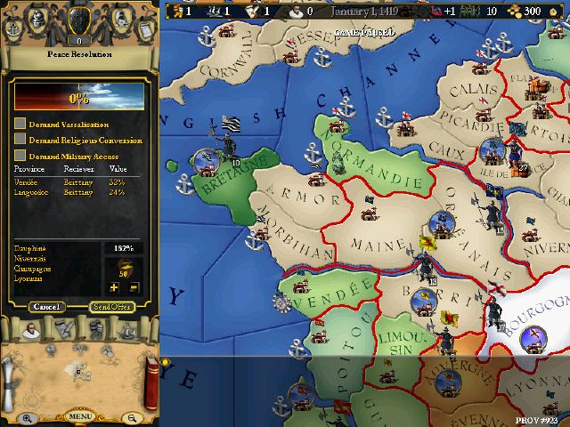
The answer is simple, and depressing: EU3 looks terrible. There’s a great game in there, but the presentation can be summed up in one word: awful. EU3 abandoned the beautiful painted map of EU2 and replaced it with a blocky, chunky 3D map that looks like something you’d have seen on the shelves in 2001, not 2007.
For this, we can thank the invisible hand of the marketplace. Paradox specialized for years in games that eschewed high-tech 3D graphics for simple but beautiful 2D. But as the years passed and the market moved more and more towards 3D, it became harder and harder for Paradox to get their games onto the shelves of retail stores. These stores saw 3D as a baseline requirement for a “modern” game and simply would not stock anything that did not run on a 3D engine. And that meant Paradox was frozen out.
Their intention had been to break this pattern by moving to 3D in Europa Universalis 3. And by the standard of “can we get this title onto retail shelves”, they succeeded; the 3D-powered EU3 was stocked by Best Buy and lots of other retail stores.
But Paradox’s inexperience with 3D design showed; the graphics in EU3 may have been powered by a 3D engine, but in every other way they represented a serious step backwards in visual appeal. It’s not impossible to produce a strategy game with a gorgeous 3D map (the classic game Rome: Total War proved that beyond doubt all the way back in 2004), but it takes a whole different set of skills than producing a gorgeous 2D map does.
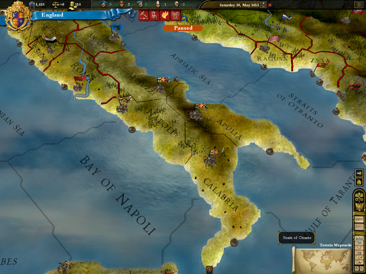
Want examples? Here’s a screenshot of EU3’s “terrain” map, which shows the physical features of the territory you are looking at:
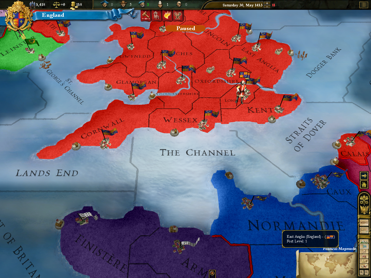
And here’s an example of EU3’s “political” map, which highlights the various nation-states on the map:
(Click either of the screenshots above for a full-size version)
As you can see, these graphics are not that great. In fact, for a game released in 2007, they’re pretty remarkably horrible, even by the pathetic standards for visuals in strategy games. They are so bad, in fact, that they turned me sour on EU3 right off the bat; I picked it up with high anticipation shortly after its release, but the graphics were such a letdown that I never had the heart to dig into it and investigate the improvements Paradox had made to the underlying game itself. I suppose that makes me a shallow SOB; so be it.
So why am I writing all this? It’s to introduce you to an heroic effort by some EU3 fans which has managed to fix this glaring problem with the game. It’s a mod for EU3 called “Theatrum Orbis Terrarum” (TOT), and its goal is to make EU3’s map as beautiful as EU2’s was. The mod’s developers describe it as “inspired by the look of early atlases”, and that’s putting it mildly; once you install the mod, your EU3 map looks as though it was ripped right out of one of those atlases. It’s pretty cool.
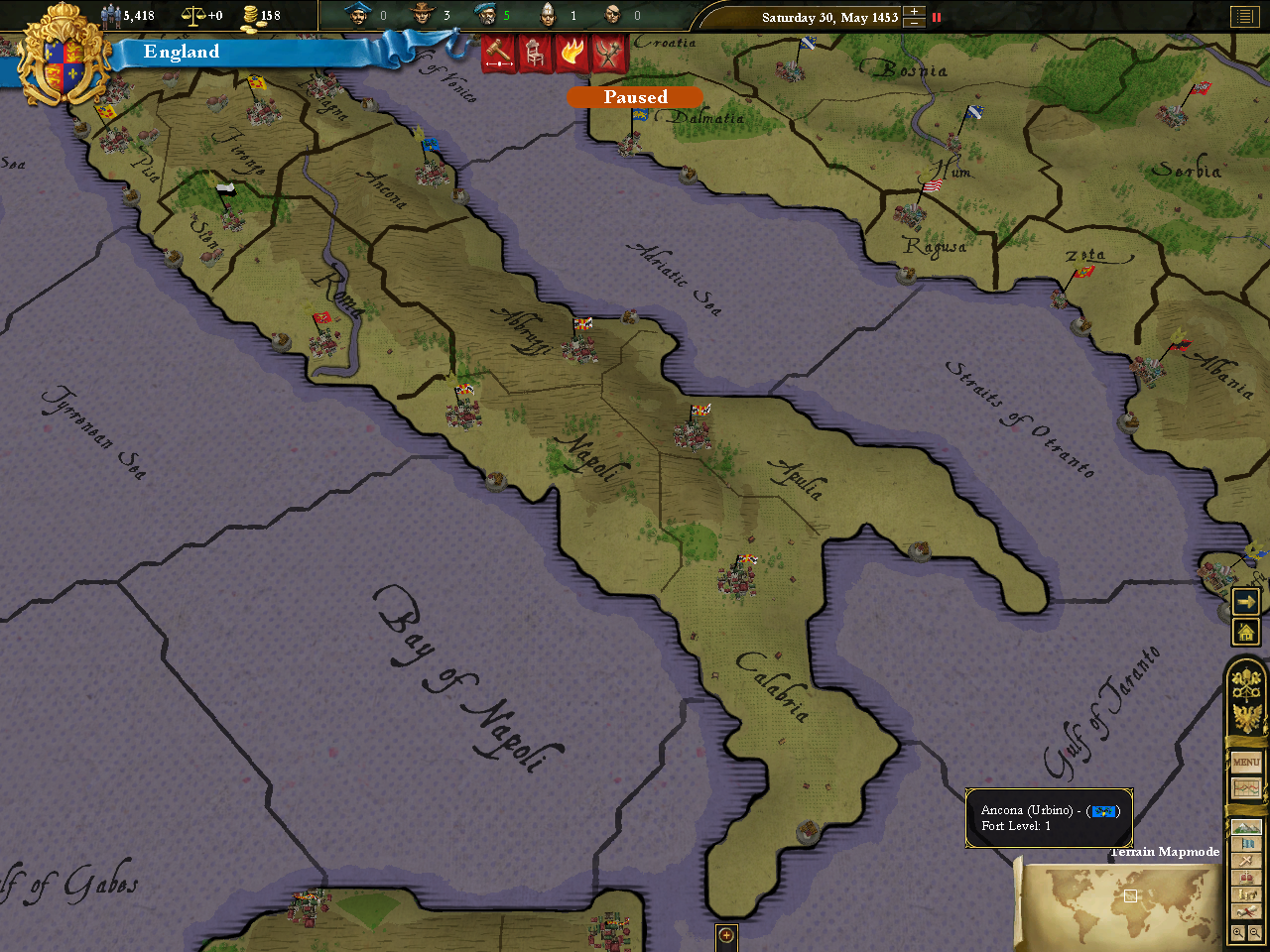
Let’s take a look at the same screens I showed you above, but with the TOT mod activated. First, the terrain map:
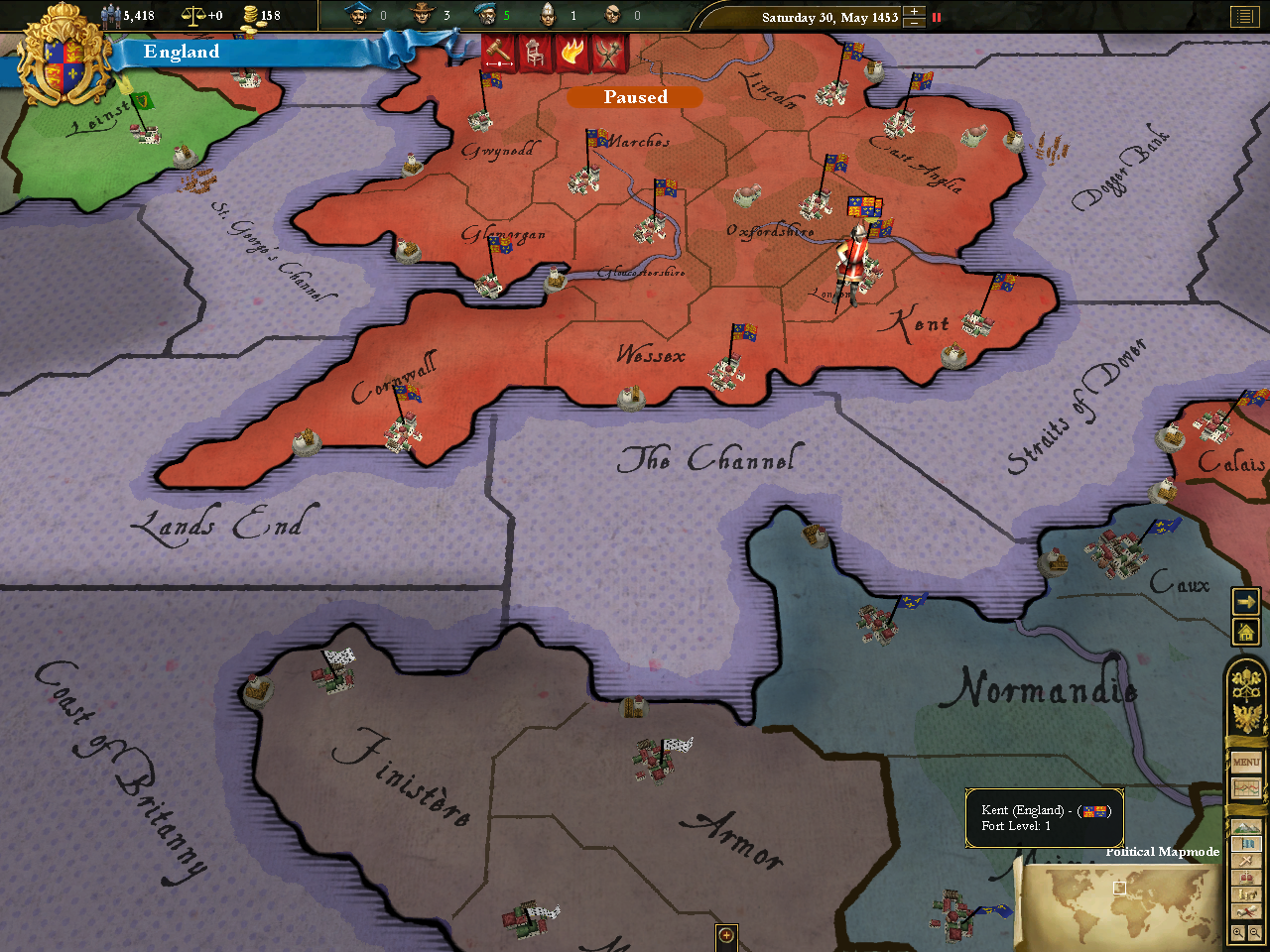
And now, the political map:
To really appreciate the difference TOT makes, you’ll need to click through to see the full size images. It’s no exaggeration, though, to say that the difference is night and day. Before TOT, the map is clunky and ugly; after TOT, it’s elegant and stylish. It’s a big enough difference that it’s gotten me to go back and try EU3 again, this time with the mod installed; and this time, I’m actually digging it. So the modders behind TOT may just have rescued this game for me. Thanks!
And the really cool thing about this is that it was produced entirely by EU3 players, on their own dime, to fix a glaring flaw in the game they loved. I wish Paradox had handled their transition to 3D better than they did; but there’s something exciting about seeing players stepping into the breach and fixing the problems themselves.
All of which is my long-winded way of saying this: if you like strategy games, and you’ve been scared away from EU3 by reports of its fugliness, maybe now’s the time for you to give it a second look too.
UPDATE (Mar. 25, 2013): Believe it or not, here we are five years after this post was written and it still attracts a steady stream of visitors. So I should probably update you with an important bit of information: to the best of my knowledge, the TOT mod no longer works with the latest editions of EU3. Each major expansion pack released for EU3 has required TOT to be updated to support it, and when the last one (Divine Wind) came out, nobody made the appropriate changes to make the mod Divine Wind-compatible. So if your EU3 setup includes Divine Wind, it’ll have to be TOT-less.
This is annoying, and since EU4 is due out later this year, I doubt we’ll see it fixed. The good news is that EU4 is supposed to be building on the advancements made in Crusader Kings II to provide a map that’s a huge improvement over EU3’s, so we may finally live in a world where de-uglifying mods are no longer required.
