Getting It Wrong
Posted on March 15, 2004
Over at the usually pretty insightful Marginal Revolution, there’s a post today by Alex Tabarrok that attempts to take Paul Krugman out to the woodshed over his much-blogged-about graph showing the Bush administration’s consistently rosy job growth projections:

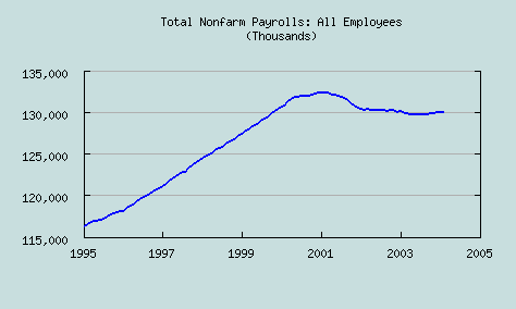
Tabarrok’s basic claim is that Krugman’s assertion that the Council of Economic Advisors (CEA) has been fluffing the numbers for political reasons is off-base, because Krugman didn’t show the whole picture in his graph. By only showing data going back to 1999, Tabarrok claims, Krugman skews the picture, making it look like the CEA’s projections were rosier than they should have been. Tabarrok says that Krugman should have gone back to 1995:

He claims that this explains the CEA’s projections, as simply a “return to trend”.
Quite frankly, I think this is more obvious spin than anything in Krugman’s piece. The reason is because of Tabarrok’s choice of years for his chart. He starts with 1995 — the start of the ’90s boom! Of course jobs grew enormously from 1995-2000. The economy was going like gangbusters. But why would anyone in their right mind, in 2002 or 2003 or 2004, predict a “return” to this trend, when the economic fundamentals had so clearly changed?
The CEA was predicting boom-like job growth, and it didn’t materialize — and Tabarrok claims that we need to put the predictions in perspective by looking back to the way things were before the bust. Hey, I wish I could; my investments were sure doing better! But that economy is gone, gone, gone, swept away by the popping of the tech bubble and the September 11 attacks. Anyone who made a prediction in 2002 that by 2004 it would “return” deserves whatever scorn Krugman sends their way.
A better comparison, if Tabarrok really wanted to provide perspective (and not spin), would have been a chart that went back to the last recession — say, one that started in 1990 or so. It would be instructive to see how CEA’s predictions hold up when compared to the U.S. economy’s actual performance in recovering from a recession. But since those years aren’t on the chart, I imagine the answer is that they don’t hold up very well…
Like I said, Marginal Revolution is a smart site, and usually does better analysis than this. Let’s hope they aren’t going to be spending much time in the future making weak excuses for political hackery like these job projections.
UPDATE: This discussion is continued at Getting It Wrong, Revisited.


